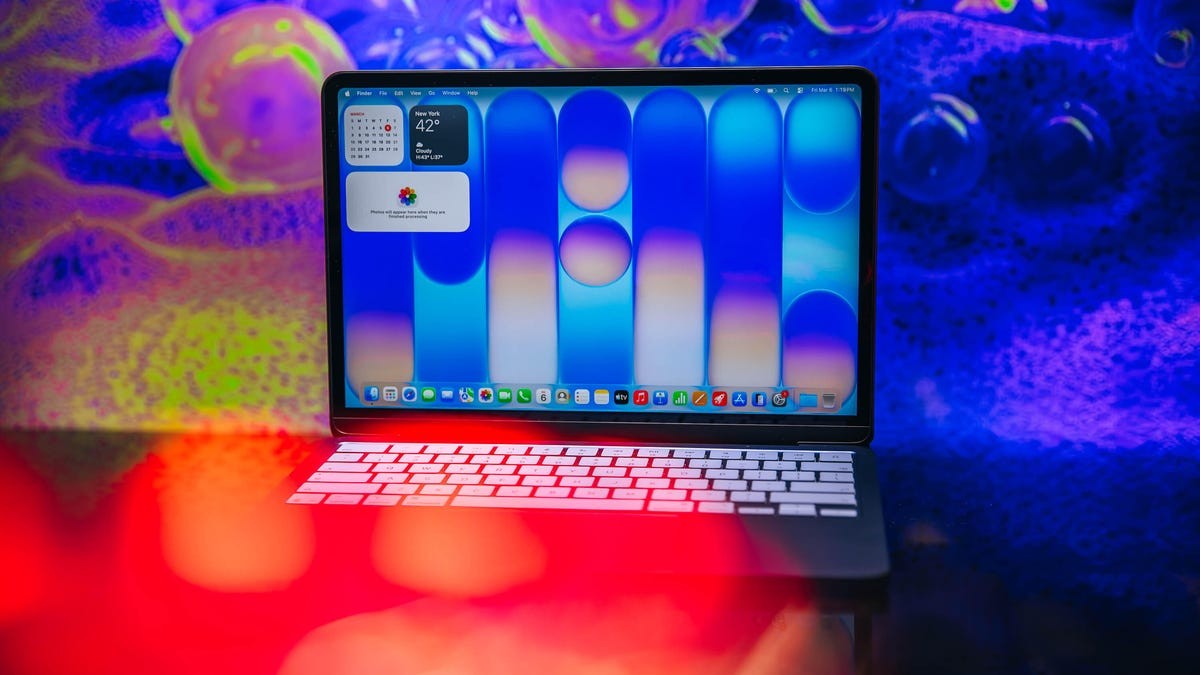
Apple is bringing order to chaos in macOS Tahoe.
The latest update, code-named Golden Gate, targets one of the most frustrating quirks in the recent operating system: the jarring mismatch in corner radii. For over a year, switching between native Apple apps and third-party software felt like jarring a vinyl record. Now, Apple is smoothing that noise out.
The Visual Dissonance of MacOS Tahoe
I won’t pretend I was at the WWDC 2022 keynote cheering for AI. While Spatial Reframing and a context-aware Siri might please some, I’m not the target demographic. I keep Apple Intelligence disabled for battery life and rarely speak to Siri. I don’t need magic to work; I need software not to break.
But the announcement at the top of this year’s keynote mattered more. It wasn’t about algorithms. It was about pixels. Specifically, how curved they are.
If you’ve lived with MacOS Tahoe, you’ve seen it. You drag your mouse from Safari to Chrome. The Safari window has subtle, soft rounded corners. The Chrome window retains sharp, traditional angles—or perhaps slightly different rounded ones, depending on the developer’s preference. The transition is visually jarring. It breaks the immersion.
This wasn’t an intentional artistic statement by the design team. It was an inconsistency born from the fragmented nature of third-party development. Apple standardized its own apps (like Safari and Freeform), giving them slightly rounder corners than previous generations. Third-party giants, however, stuck to their legacy radii or implemented updates differently.
The result? Windows that pop out from behind other windows at awkward angles.
“Attention to detail has always been core of Apple’s DNA,” VP of OS Program Management Stacey Ford said during the keynote. It is difficult to reconcile that statement with a year of mismatched corners shipping in the default OS. It felt un-Apple-like. It felt lazy.
Why Golden Gate Changes The Interface
macOS Golden Gate enforces a consistent corner radius across all applications. It doesn’t just look better; it feels cohesive. When windows slide and resize, the geometry matches. It is a subtle change that the brain notices even if the eyes don’t.
This fix highlights a deeper principle about Apple’s design philosophy. The company obsesses over physical alignment—matching the curve of AirPods cases to MacBooks. They understand that visual consistency builds trust in the hardware and software.
When elements fail to line up, it draws attention to the flaw, not the feature. Inconsistent radii were a flaw. Golden Gate removes them.
For years, Mac power users asked for more control over window management. They wanted tiling. They wanted strict grids. They didn’t always ask for fixed corners. But consistency is a baseline.
The update addresses the visual clutter of mixed geometry. It also implicitly challenges third-party developers who might ignore these system-level adjustments. Or perhaps it simply standardizes what Apple can enforce without breaking apps.
I still ignore Siri. I still block the AI features on my MacBook to save juice. But as I shift from the Notes app back to Chrome this morning, I don’t see the jagged edges of a design compromise anymore.
I see a consistent screen.
It is a small change. Unlikely to drive hardware sales. But in a year defined by noisy AI announcements, a clean corner might be the most Apple feature released this decade.
Wait.
Does that mean Chrome will eventually have to update to match, or will Apple force the render engine?